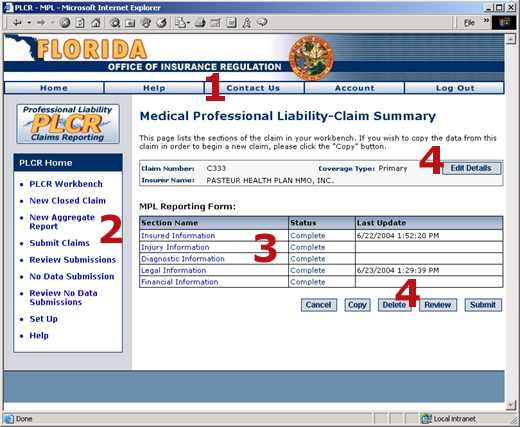


Navigating the PLCR ApplicationNavigating the PLCR interface is quite simple once you've learned the basics. The screen shot below displays a typical PLCR page. The large red numbers indicate specific areas of navigation functionality described in more detail below.
Key Areas of PLCR Navigation
Area 1: I-Portal Header ButtonsThe Industry Portal Header Navigation Buttons are displayed below.
PLCR is one of several applications under the Industry Portal (I-Portal) umbrella. The Industry Portal Header Navigation buttons are universal throughout all I-Portal applications. The function of each button is described below:
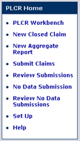
Area 2: The PLCR Task BarThe PLCR Task Bar is displayed below.
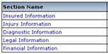
Area 3: Hypertext LinksHypertext links are a common navigation method within PLCR.
To access specific portions of the PLCR application, you'll need to click on hypertext links within certain sections of the application. Hypertext links in PLCR are indicated by green text. When you place your mouse over the text you'll notice that the text also becomes underlined. This means you can click on the text to navigate to another page in the application. In the example above, clicking on the Insured Information link will navigate to the Insured Information Section of an MPL Claims Form. Most hypertext links are self descriptive, allowing for a very intuitive navigation process.
Area 4: ButtonsA typical list of Workbench buttons is displayed below.
In order to take key actions on your work in PLCR you'll often use buttons to confirm the action. Key actions might include canceling your work, deleting your work, or saving your work. Such buttons are located on the bottom right of most PLCR pages, below your work area.
Clicking the appropriate button will perform the action specified on the button's label (i.e., clicking the Save button will save your work). The PLCR help system notes the use of buttons by bolding the text of the button label.
Buttons that appear to have gray text indicate that a function you may wish to perform is not yet available. These buttons often become enabled after you take some initial first action. In the screen shot above, the Submit button is grayed out. In order for it to become active and "clickable" you must first complete all sections of the claim A demand for payment from a self-insured entity or an insurer for losses sustained by a claimant. form so that their status reads "Complete". Doing so will enable the button. When the button becomes enabled, the text of the button label will become white.
|